Tech news 6: Creating animated figures
This week, some fun with animated figures. We send each other gifs but they rarely come to mind when it comes to showing scientific processes or results. They are actually pretty easy to make in R!
Here are a few examples using gganimate. There are other packages out there but gganimate is really well integrated with ggplot2.
A simple boxplot
library(ggplot2)
library(gganimate)

ggplot(mtcars, aes(factor(cyl), mpg)) +
  geom_boxplot() +
  # Here comes the gganimate code
  transition_states(
    gear,
    transition_length = 2,
    state_length = 1
  ) +
  enter_fade() +
  exit_shrink() +
  ease_aes('sine-in-out’)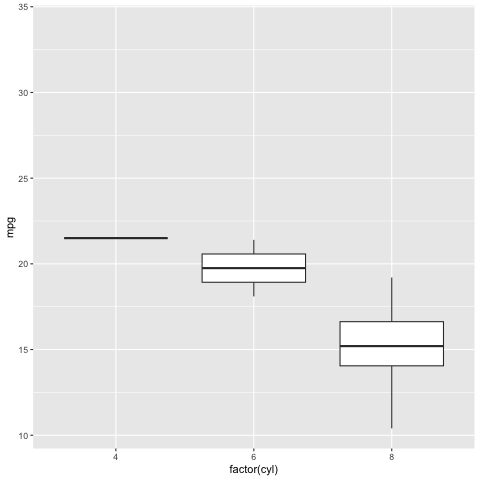
Code and figure by gganimate authors Thomas Lin Pedersen and David Robinson 1
A much more informative scatter plot with evolution in time
library(gapminder)

ggplot(gapminder, aes(gdpPercap, lifeExp, size = pop, colour = country)) +
  geom_point(alpha = 0.7, show.legend = FALSE) +
  scale_colour_manual(values = country_colors) +
  scale_size(range = c(2, 12)) +
  scale_x_log10() +
  facet_wrap(~continent) +
  # Here comes the gganimate specific bits
  labs(title = 'Year: {frame_time}', x = 'GDP per capita', y = 'life expectancy') +
  transition_time(year) +
  ease_aes('linear')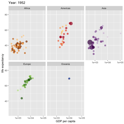
Code and figure by gganimate authors Thomas Lin Pedersen and David Robinson 2
And a map!
library(ggplot2)

center_lat <- 37.8 # Some random data
center_long <- -122.4
width <- 0.2
num_points <- 500
test_data <- data.frame('lat'=rnorm(num_points, mean=center_lat, sd=width),
                        'long'=rnorm(num_points, mean=center_long, sd=width),
                        'year'=floor(runif(num_points, min=1990, max=2020)),
                        'temp'=runif(num_points, min=-10, max=40)
)
min_long <- min(test_data$long)
max_long <- max(test_data$long)
min_lat <- min(test_data$lat)
max_lat <- max(test_data$lat)
num_years <- max(test_data$year) - min(test_data$year) + 1

county_info <- map_data("county", region = "california") # The map background

map_with_shadow <- ggplot(data = county_info,
                          mapping = aes(x = long, y = lat, group = group)) +
   geom_polygon(color = "black", fill = "white") +
   coord_quickmap() +
   theme_void()  +
   geom_point(data = test_data, aes(x = long, y = lat,
                                    color = temp, size = temp, group = year)) +
   coord_quickmap(xlim = c(min_long, max_long),
                  ylim = c(min_lat, max_lat)) +
   gganimate::transition_time(year) +
   ggtitle('Year: {frame_time}',
           subtitle = 'Frame {frame} of {nframes}') +
   gganimate::shadow_mark()
gganimate::animate(map_with_shadow, nframes = num_years, fps = 2)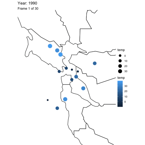
Code and figure by David J. Lilja 3
Great resources
- https://rquer.netlify.app/animated_chart/evolution/ many examples but it’s in Spanish
- https://rquer.netlify.app/animated_map/animated_map/ especially for maps
Cheers,
Alban
Footnotes
Pedersen T, Robinson D (2022). gganimate: A Grammar of Animated Graphics. https://gganimate.com, https://github.com/thomasp85/gganimate.↩︎
Pedersen T, Robinson D (2022). gganimate: A Grammar of Animated Graphics. https://gganimate.com, https://github.com/thomasp85/gganimate.↩︎
David J. Lilja, “How to Plot and Animate Data on Maps Using the R Programming Language,” University of Minnesota Digital Conservancy, https://hdl.handle.net/11299/220339, June, 2021.↩︎